The Latest
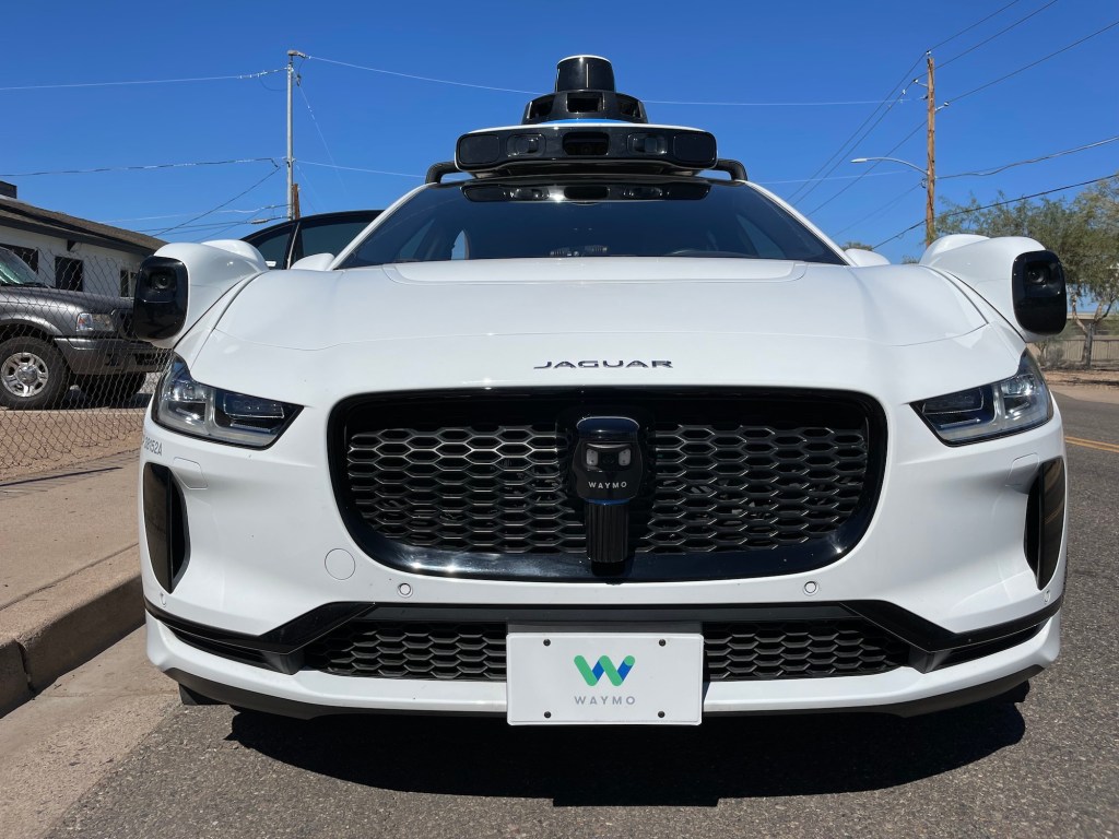
The company’s autonomous vehicles have had a number of misadventures lately, involving driving into construction sites.
Startups
Sona, a frontline workforce management platform, raises $27.5M with eyes on US expansion
1 hour ago
Sona, a workforce management platform for frontline employees, has raised $27.5 million in a Series A round of funding. More than two-thirds of the U.S. workforce are reportedly in frontline…

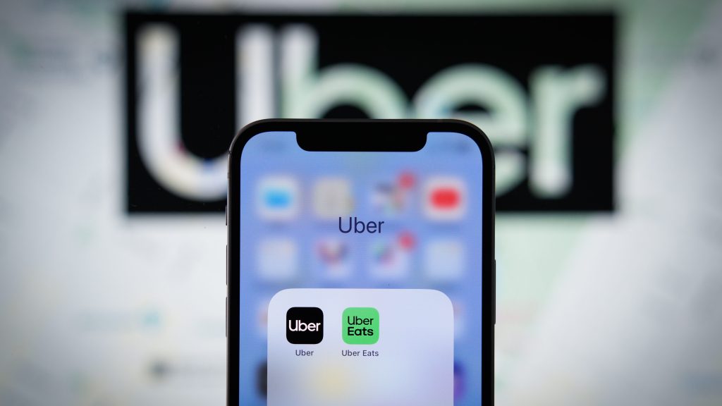
Uber Technologies announced Tuesday that it will buy the Taiwan unit of Delivery Hero’s Foodpanda for $950 million in cash. The deal is part of Uber Eats’ strategy to expand…
Paris-based Blisce has become the latest VC firm to launch a fund dedicated to climate tech. It plans to raise as much as €150M (about $162M).

Maad, a B2B e-commerce startup based in Senegal, has secured $3.2 million debt-equity funding to bolster its growth in the western Africa country and to explore fresh opportunities in the…

The fresh funds were raised from two investors who transferred the capital into a special purpose vehicle, a legal entity associated with the OpenAI Startup Fund.

Accel has invested in more than 200 startups in the region to date, making it one of the more prolific VCs in this market.

Kyle Vogt, the former founder and CEO of self-driving car company Cruise, has a new VC-backed robotics startup focused on household chores. Vogt announced Monday that the new startup, called…

Venture
From Miles Grimshaw to Eva Ho, venture capitalists continue to play musical chairs
12 hours ago
When Keith Rabois announced he was leaving Founders Fund to return to Khosla Ventures in January, it came as a shock to many in the venture capital ecosystem — and…

On the heels of OpenAI announcing the latest iteration of its GPT large language model, its biggest rival in generative AI in the U.S. announced an expansion of its own.…
Where we’ll be next
Oct 28th
TechCrunch Disrupt 2024
San Francisco, CA
Jun 11th
StrictlyVC – Washington, D.C.
Washington, D.C.
May 21st
StrictlyVC – London
London
If you’re looking for a Starliner mission recap, you’ll have to wait a little longer, because the mission has officially been delayed.

Apple devoted a full event to iPad last Tuesday, roughly a month out from WWDC. From the invite artwork to the polarizing ad spot, Apple was clear — the event…

Terri Burns, a former partner at GV, is venturing into a new chapter of her career by launching her own venture firm called Type Capital.
The decision to go monochrome was probably a smart one, considering the candy-colored alternatives that seem to want to dazzle and comfort you.

Hardware
Apple and Google agree on standard to alert people when unknown Bluetooth devices may be tracking them
17 hours ago
Apple and Google announced on Monday that iPhone and Android users will start seeing alerts when it’s possible that an unknown Bluetooth device is being used to track them. The…

The company is describing the event as “a chance to demo some ChatGPT and GPT-4 updates.”

A human safety operator will be behind the wheel during this phase of testing, according to the company.

OpenAI announced a new flagship generative AI model on Monday that they call GPT-4o — the “o” stands for “omni,” referring to the model’s ability to handle text, speech, and…

Featured Article
The women in AI making a difference
As a part of a multi-part series, TechCrunch is highlighting women innovators — from academics to policymakers —in the field of AI.
18 hours ago

Government & Policy
White House proposes up to $120M to help fund Polar Semiconductor’s chip facility expansion
18 hours ago
The expansion of Polar Semiconductor’s facility would enable the company to double its U.S. production capacity of sensor and power chips within two years.
