The Latest
To give AI-focused women academics and others their well-deserved — and overdue — time in the spotlight, TechCrunch has been publishing a series of interviews focused on remarkable women who’ve contributed to…

We took the pulse of emerging fund managers about what it’s been like for them during these post-ZERP, venture-capital-winter years.

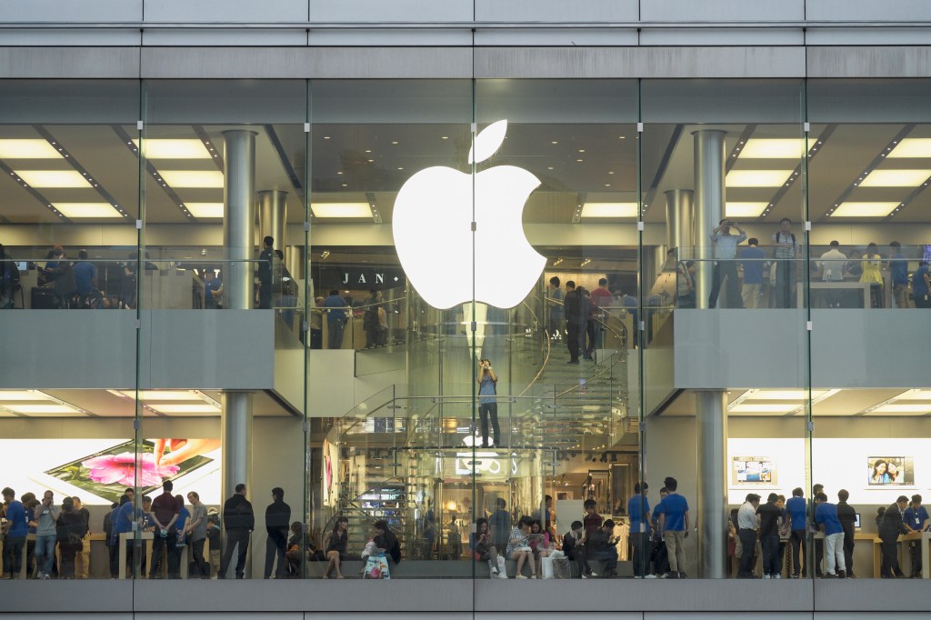
It’s been a busy weekend for union organizing efforts at U.S. Apple stores, with the union at one store voting to authorize a strike, while workers at another store voted…
Alora Baby is not just aiming to manufacture baby cribs in an environmentally friendly way but is attempting to overhaul the whole lifecycle of a product

Go on, let bots date other bots
9 hours ago
Bumble founder and executive chair Whitney Wolfe Herd raised eyebrows this week with her comments about how AI might change the dating experience. During an onstage interview, Bloomberg’s Emily Chang…

Welcome to Week in Review: TechCrunch’s newsletter recapping the week’s biggest news. This week Apple unveiled new iPad models at its Let Loose event, including a new 13-inch display for…

The U.K. Safety Institute, the U.K.’s recently established AI safety body, has released a toolset designed to “strengthen AI safety” by making it easier for industry, research organizations and academia…

AI startup Runway’s second annual AI Film Festival showcased movies that incorporated AI tech in some fashion, from backgrounds to animations.

Rachel Coldicutt is the founder of Careful Industries, which researches the social impact technology has on society.

Enterprise
SAP’s chief sustainability officer isn’t interested in getting your company to do the right thing
1 day ago
SAP Chief Sustainability Officer Sophia Mendelsohn wants to incentivize companies to be green because it’s profitable, not just because it’s right.

Where we’ll be next
Oct 28th
TechCrunch Disrupt 2024
San Francisco, CA
Jun 11th
StrictlyVC – Washington, D.C.
Washington, D.C.
May 21st
StrictlyVC – London
London
Transportation
Tesla’s profitable Supercharger network is in limbo after Musk axed the entire team
1 day ago
Here’s what one insider said happened in the days leading up to the layoffs.

StrictlyVC events deliver exclusive insider content from the Silicon Valley & Global VC scene while creating meaningful connections over cocktails and canapés with leading investors, entrepreneurs and executives. And TechCrunch…
Commerce
Meesho, an Indian social commerce platform with 150M transacting users, raises $275M
2 days ago
Meesho, a leading e-commerce startup in India, has secured $275 million in a new funding round.

Some Indian government websites have allowed scammers to plant advertisements capable of redirecting visitors to online betting platforms. TechCrunch discovered around four dozen “gov.in” website links associated with Indian states,…

Transportation
Motional cut about 550 employees, around 40%, in recent restructuring, sources say
2 days ago
Around 550 employees across autonomous vehicle company Motional have been laid off, according to information taken from WARN notice filings and sources at the company. Earlier this week, TechCrunch reported…

The company is describing the event as “a chance to demo some ChatGPT and GPT-4 updates.”

The deck included some redacted numbers, but there was still enough data to get a good picture.

Unlike ChatGPT, Claude did not become a new App Store hit.

Scarcely five months after its founding, hard tech startup Layup Parts has landed a $9 million round of financing led by Founders Fund to transform composites manufacturing. Lux Capital and Haystack…

Welcome to Startups Weekly — Haje‘s weekly recap of everything you can’t miss from the world of startups. Sign up here to get it in your inbox every Friday. Look,…
